
I have taken a few colouring classes over the past couple of years, both free and paid, and a high priority was to learn to colour skin and hair. Here is a link to my Colouring Resources Page which contains links to classes and tutorials I have done and can definitely recommend.
Colouring people and other characters such as mermaids are super fun, but in light of recent events, it occurred to me that I had not yet extended my colouring palette to include people of different nationalities (or even a sun tan!). This is something I had always intended on sitting down and working out but hadn’t actually taken the time, which, when I think about it is very short sighted, as New Zealand is a very multi-cultural country! I hope that by doing this exercise I continue to have a more accurate and inclusive portrayal of people both in my own community and further afar.


This is a page from the free Markers 101 Class at Kit & Clowder (suitable for all alcohol marker types). There are many other little freebie classes and digital images, I definitely encourage you to visit the Kit & Clowder community – either via Facebook or their website.
I had previously coloured the top four images as part of my original class. I still consider myself a beginner colourist, and have only been practicing my colouring on small images and stamps for cards for around 2 years or so.
So I got my workbook back out, tried out some colour combinations and filled in my final decisions for the bottom two images. My goal for now is to get out of my comfort zone of reaching for my habitual choices of colour and really think about what I’m representing in my projects.
Now to flex these skills!
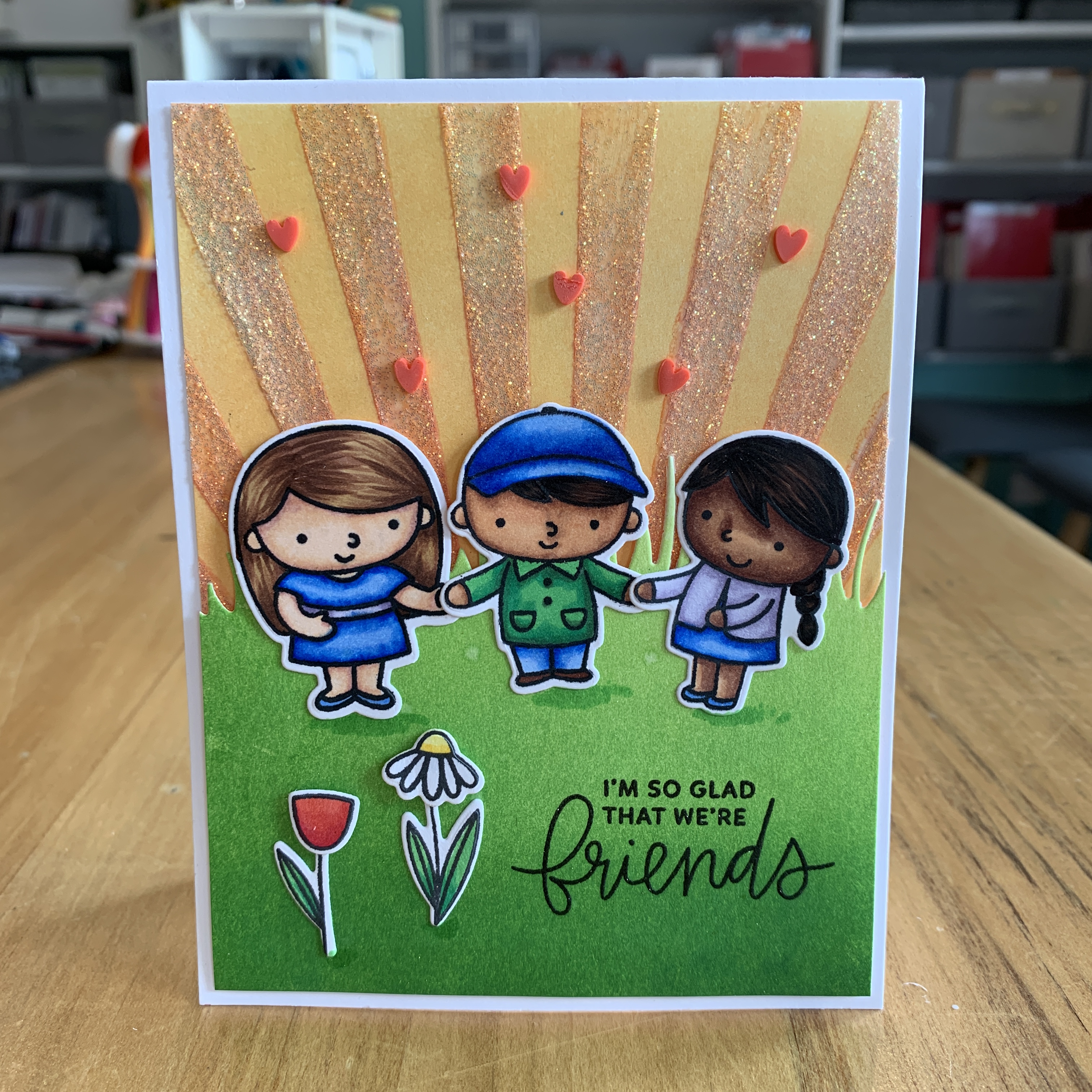
Pretty Pink Posh have very cute people stamp sets with simple line designs, they suit many card occasions, and they’re the ones I reached for today in order to practice my new combinations.
Another stamp set I regularly colour are the MFT Mermaids, so I decided to colour one of these up as well.


For this card, I stencilled the sky using Distress Inks in Worn Lipstick and then Squeezed Lemonade over the top of that, plus a layer of Gina K Glitz Glitter Gel.
I distress inked the grassy hill with Mowed Lawn and Twisted Citron. I added a bit of foam to the back of this piece, arranged my friends and stamped the sentiment. I added the little flowers which are included in one of the stamp sets, and scattered some clay hearts from Honey Bee Stamps.


Copics Used:
Skin: Girl 1 – E04, E11, E21, E00, E000; Boy – E27, E25, E23, E21; Girl 2 – E29, E27, E25, E23, E21;
Hair: Girl 1 – E59, E57, E55; Boy & Girl 2 – 100, E49, E59
Clothing: B28, B24, B21, G09, G14, YG06, V25, V22, V20;
Flowers: Y18, Y15, R29, R27, R24, C1, C0

This card front is die cut with the largest MFT stitched rectangle and an Avery Elle wonky rectangular frame was die cut a few times, stacked and textured pattered paper popped in for the background.
The same patterned paper was used for the top layer of Kindness. I also added shimmer with a Nuvo Aqua Glimmer pen to the people and the Kindness die cut.
Copics Used:
Skin: Girl – E27, E25, E23, E21; Boy – E04, E11, E21, E00, E000;
Hair: Girl – 100, E49, E59; Boy – E23, Y26, E55, E53;
Clothing: B28, B24, B23, BG57, BG45, BG10, RV66, RV17, V04
Unfortunately the Kindness stamp and die set has been discontinued by MFT but I was lucky and managed to find it at Frantic Stamper earlier this year. Frantic Stamper is a US retailer and brilliant for sourcing hard to find, discontinued stamp sets as well as all the current goodies. At the time of publishing this blog, this set was still in stock with them and I have provided a direct link below.

I love making cards with mermaids, and this My Favorite Things Mermazing set is definitely one of my most favourite. It is one of the first stamp sets I ever purchased from MFT!
I’ve coloured her up thus far, and will include her on a card in the near future.
Copics Used:
Skin E27, E25, E23, E21; Hair 100, E49, E57;
Clothing RV66, RV09, RV06, RV04;
Rock W9, W7, W5, W3;
Shell R85, R56, RV34;
Fish YR18, YR16, Y15;
Turtle G09, G05, YG06, YG03, YG67 YG63, YG61
This completes my cards and colouring skill practice today. Thank you for stopping by! Below are links to the products I have used – some are affiliate links (not all) which simply means I may get a small commission at no extra cost to you when shopping. Thank you for your support – it means I can keep creating and sharing with you.
 https://linkdeli.com/widget.js?id=f5e8378456858c916708
If you have any questions regarding the putting together of any of these cards, please feel free to message me – I’m only too happy to help!


